Complete guide to Color grading in Lightroom and Adobe Camera RAW
Have you ever wondered how to use the Color grading tool inside Lightroom and Adobe Camera Raw? Here is your complete guide to all the settings in the Color Grade tool in Lightroom and ACR.
This isn’t a tutorial on color theory, it is a tutorial on how to get the best color grading results using this tool and it covers 2 important sliders that are often overlooked.
You can find the color Grade tool in Lightroom (v10 2021 and newer) under the develop module. I’ll start with an explination of the settings, then we will apply them to 3 images to show how to work highlights, shadows and add a cinematic color grade to photos.
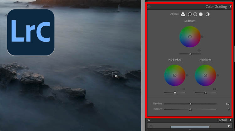
You will also find it under Filter>Camera RAW in Photoshop 2021 and newer.
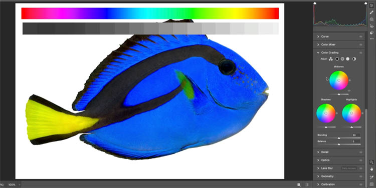
If you want a larger view of the color wheels, click the Shadows, midtone or highlights buttons.
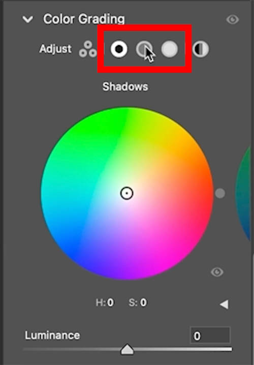
Shadow, Highlight and Midtones
Here I created a gray and color scale so you can see the effects of the adjustments. This part is best viewed in the video at the top.
As we move the shadows, notice how it affectsa the left side of the grayscale bar as well as the blacks in the image.
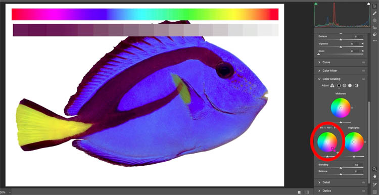
The highlights shifts the left side of the scale and the bright parts of the image.
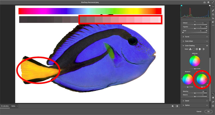
Midtones affects the mids in the image, see the middle of the grayscale bar.
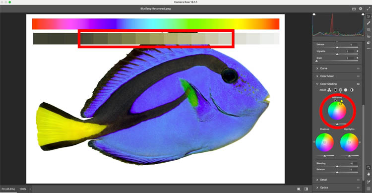
Hue, Saturation and Luminance
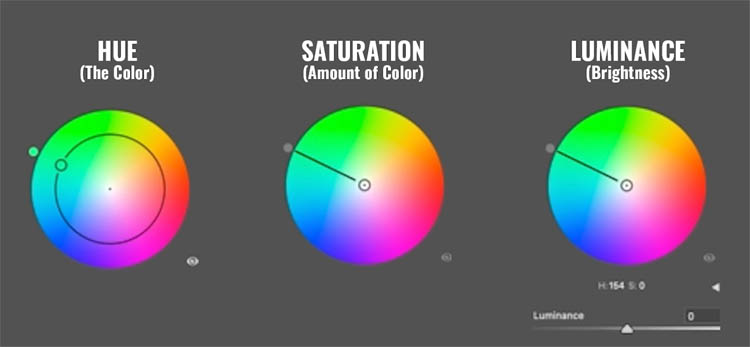
Drag around the circle (wheel) to change the color (Hue).
Drag towards the edges of the wheel to increase saturation (amount of color). Drag towards center to reduce the saturation.
Drag the Luminance slider to increase/decrease brightness.
Tips for using Color Grade
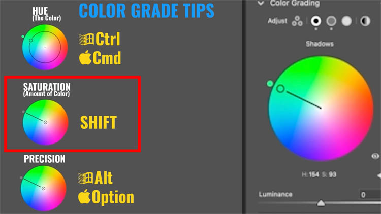
Hold down Ctrl/Cmd to constrain adjustments to Hue only
Shift key constrains to Saturation only without changing hue
The Alt/Option key allows you to make fine adjustments as it slows down your movements.
Balance
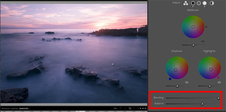
The balance slider will favor a color and apply the tint to all the ranges in the image
Balance to the left will favor the Shadow tone (If you have changes it, otherwise it will have no effect).
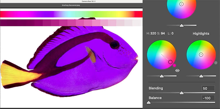
Move Balance to the right to favor the color on the Highlight wheel
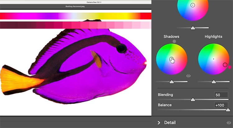
If blending is in the middle, it favors the midtone wheel. The midtones are also influenced by the shadow and highlight colors.
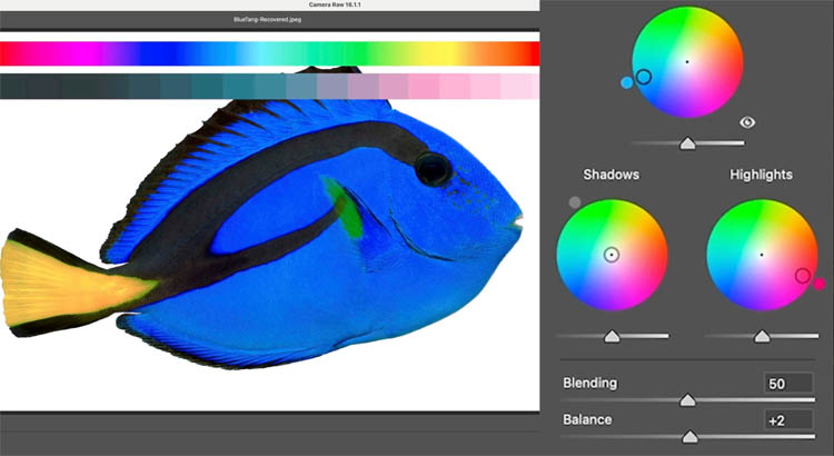
Blending
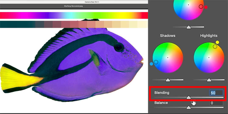
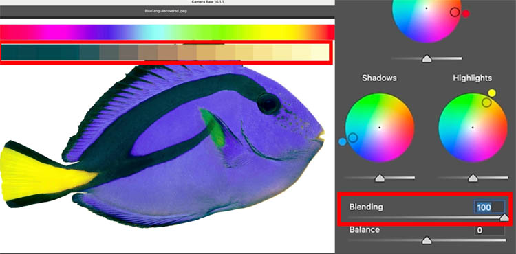
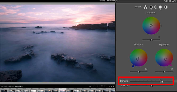
The blending slider will separate the colors in the regions, or blend then together.
Move the Blending slider to the left and the colors are more separated and contained to their respective regions.
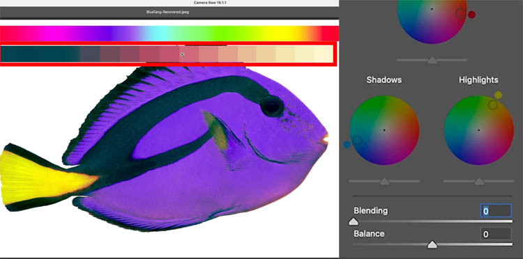
As the slider is pushed to the right, the colors are now distributed through the other tones and blend with each other more.
Color Grading Highlights (Blending use case)
Remember this is a Color grade, not a color correction. You should do color color correction first, grading is to add some style.
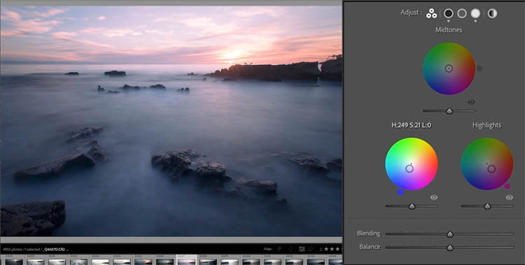
Let’s color grade the highlights on this photo I shot in Maui Hawaii.
Add a little pink to the highlights
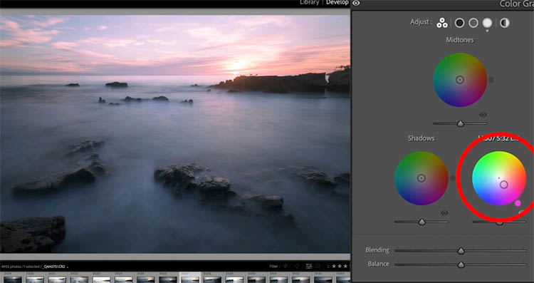
Add a little blue to the shadows (a very common color grade move).
See how the color is present in the highlight/shadows regions, but it’s very separated and doesn’t blend much.
As we move the blending to the right, the colors blend together much better. See the highlights on the water.
Experiment with the Balance as well
Color Grading Shadows
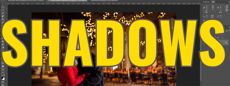
Here is a photo, that has lots of shadows.
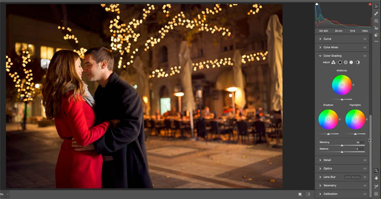
It can look nice to add a little greenish tint to the shadows to add a bit of style
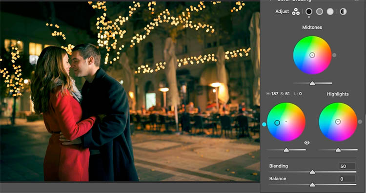
Or we could add a little blue.
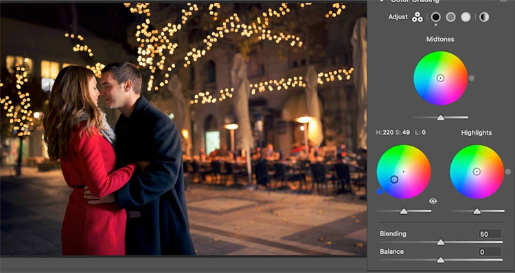
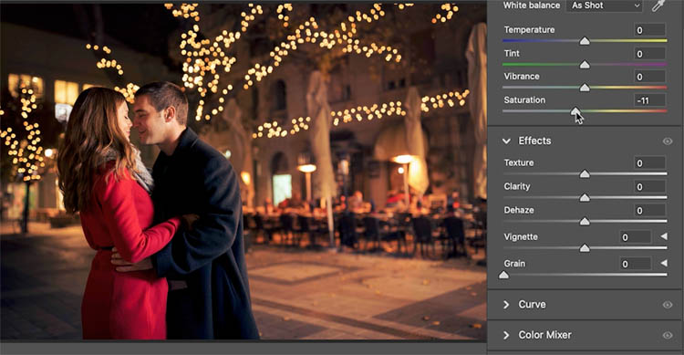
(Optional) Sometimes when you add some color in the shadows and midtones, you will need to reduce the saturation a little bit to keep skin tones more natural.
Cinematic color
Lets make a cinematic color grade

here is the starting photo
The most common look is the Teal and orange, or blue and orange color grade, also known as the Blockbuster look. This is achieved by adding teal or blue to shadows and orange to highlights.
Notice the Luminance in the shadows and highlights. I have boosted the darks in the shadows and increased brightness in highlights to add contrast punch.
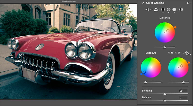
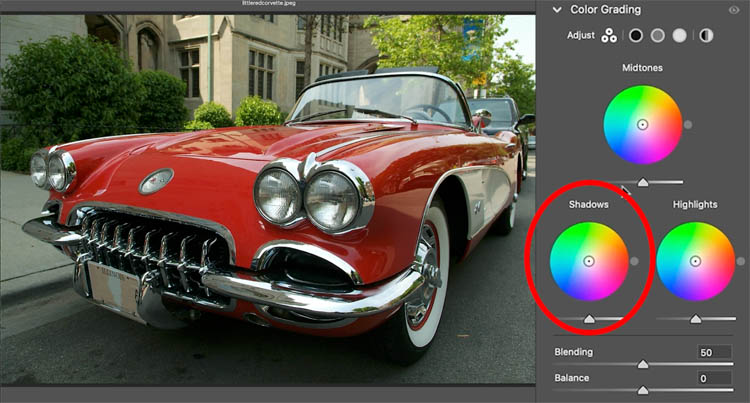
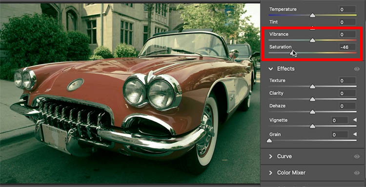
Let’s do another vintage period color grade, that I enjoy.
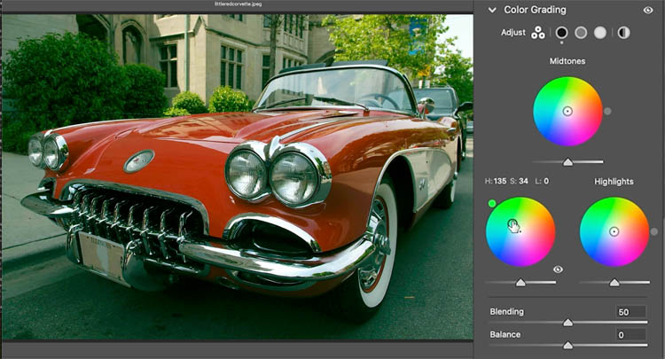
Add some greens into the shadows.
Adding yellow to the highlights adds a nice look.
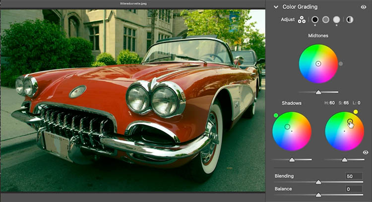
Usually this is accompanied by reducing the saturation somewhat
Hopefully this tutorial has given you some insight into this very powerful tool in Lightroom and camera raw.
If you are getting value from my tutorials, please tell your friends about PhotoshopCAFE and share them on social media.
Great to see you here at the CAFE
Colin
The post Ultimate Guide to ACR Lightroom Color Grading Tool appeared first on PhotoshopCAFE.
![[DEV]Schenectady Photographic Society](https://dev.spsphoto.org/wp-content/uploads/2020/03/newsitelogo5-e1584673483198.png)